

Breaking the Tradie Branding Mould
ADELAIDE PAINT CO.
- Business naming
- Brand strategy
- Logo design
- Visual identity
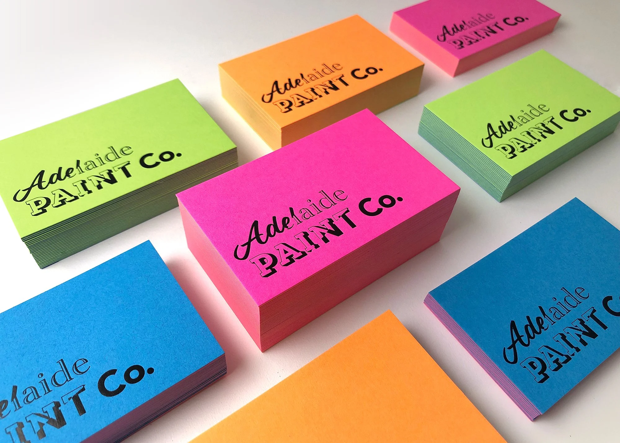
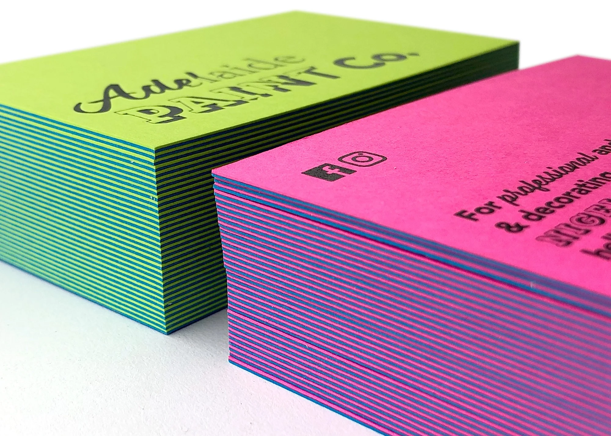
- Business stationery
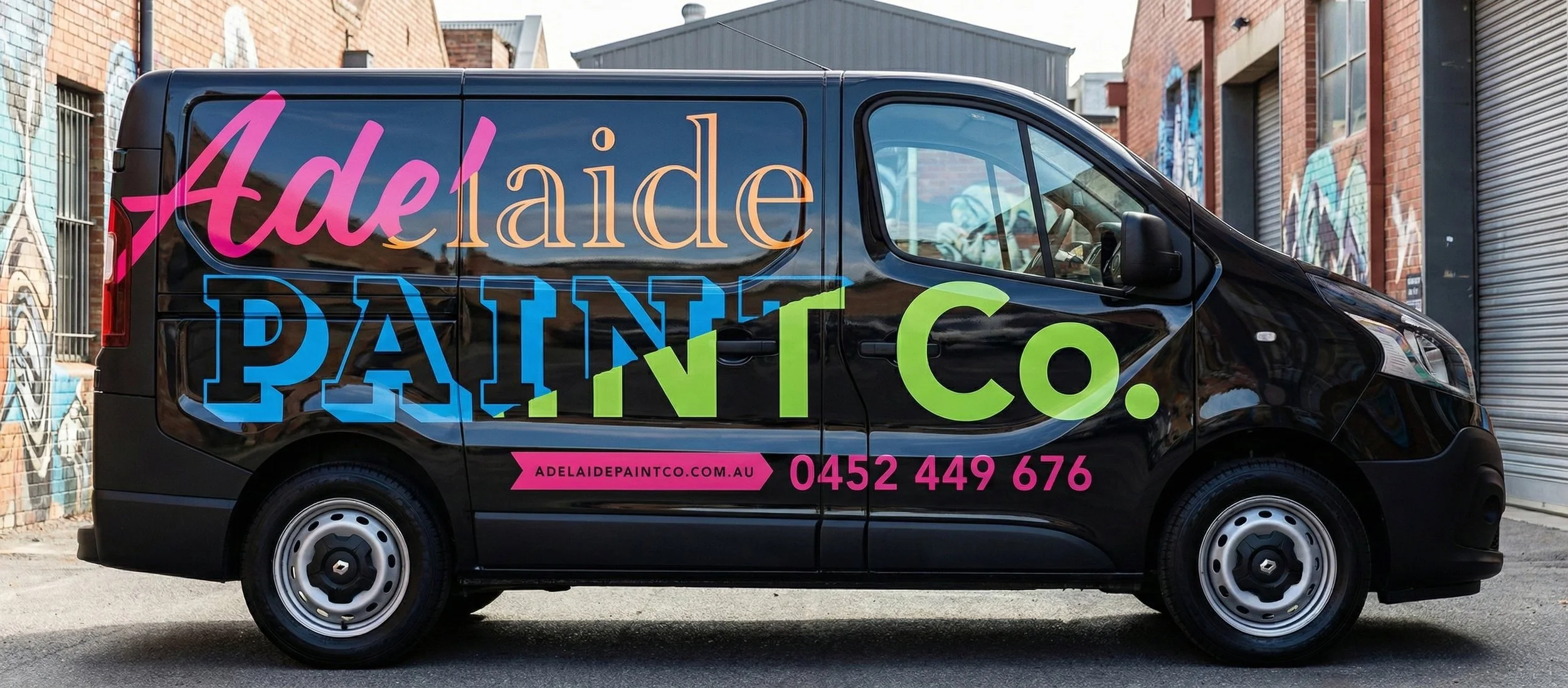
- Vehicle signage
- Website
Adelaide Paint Co engaged me at the very beginning of their business, with a clear goal of entering the Adelaide painting and decorating market looking established, premium and a cut above the usual backyard operators. As a new brand, they needed to build trust quickly and present themselves in a way that would appeal to high-end residential and commercial clients from day one.
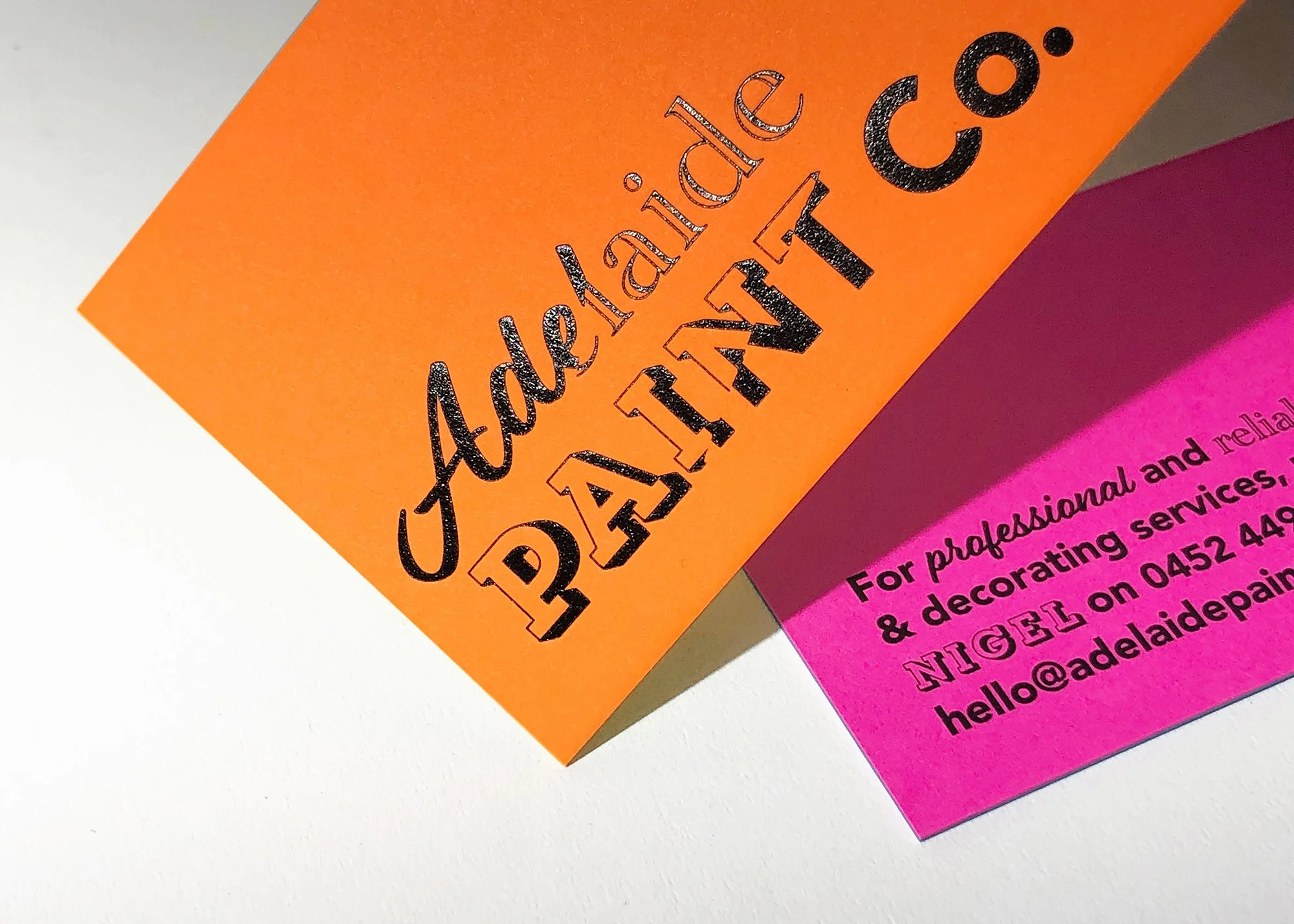
The project began with business naming exploration, helping shape a name that felt local, confident and professional. From there, I developed a distinctive brand identity centred around a logo concept inspired by torn wallpaper and layers of paint being refreshed. The mark was designed to feel like multiple logos peeled back over time, subtly referencing transformation, craftsmanship and the act of painting over the old to create something new.
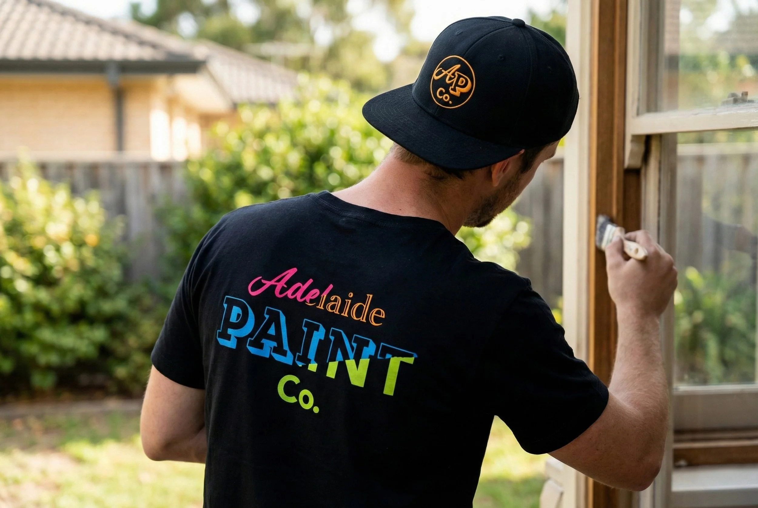
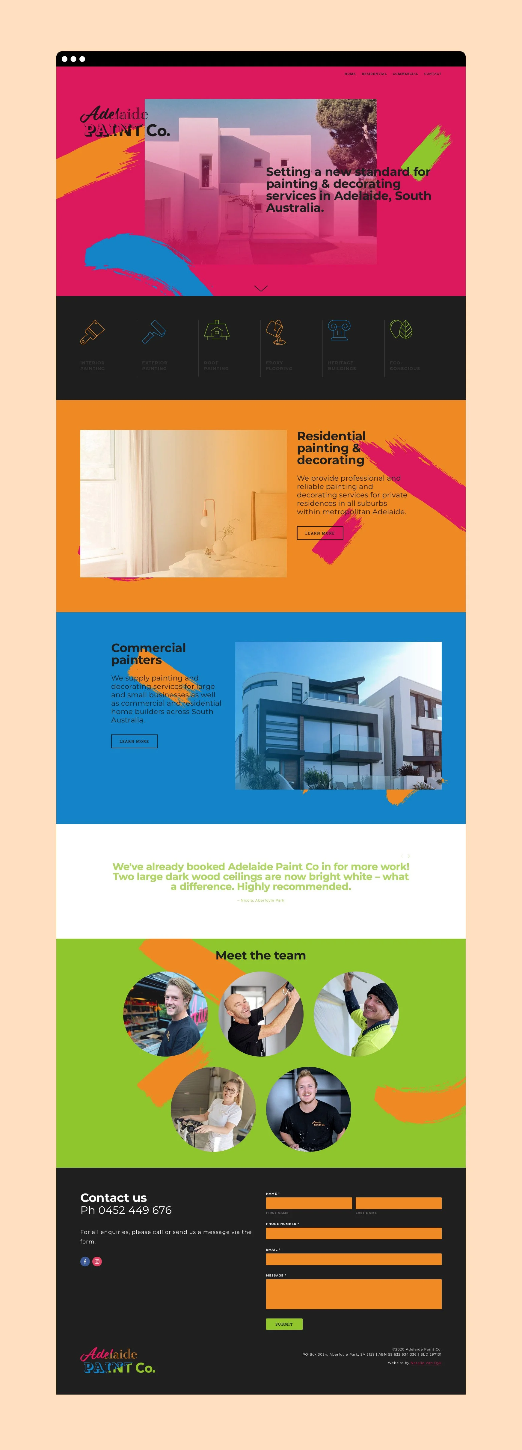
That identity was then rolled out across every customer touchpoint, including vehicle signage, uniforms, invoice / quote templates, email signatures and a custom website. The bold vehicle graphics in particular became a standout marketing asset, often leading people to assume Adelaide Paint Co had an entire fleet on the road, despite operating with a single van at launch.
While the quality of their work has driven strong word-of-mouth, the professionalism and consistency of their branding has played a key role in positioning Adelaide Paint Co as a credible, high-end painting contractor. This cohesive brand presence has helped them confidently secure contracts with some of Adelaide’s most prestigious builders, proving that strong branding isn’t just cosmetic, it’s commercial.