

Refreshing a Granola Brand
FRESH NESS FINE FOODS
- Packaging design
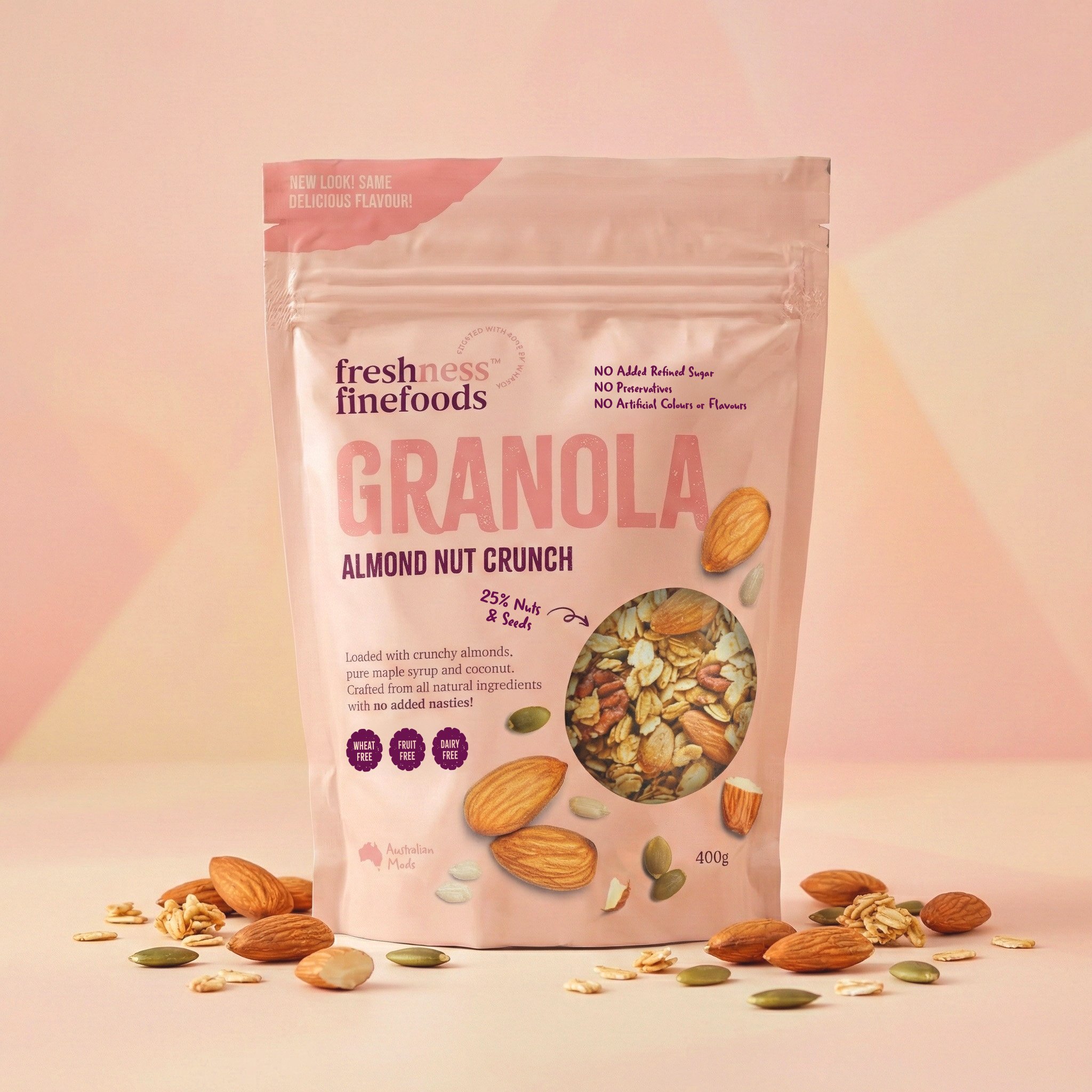
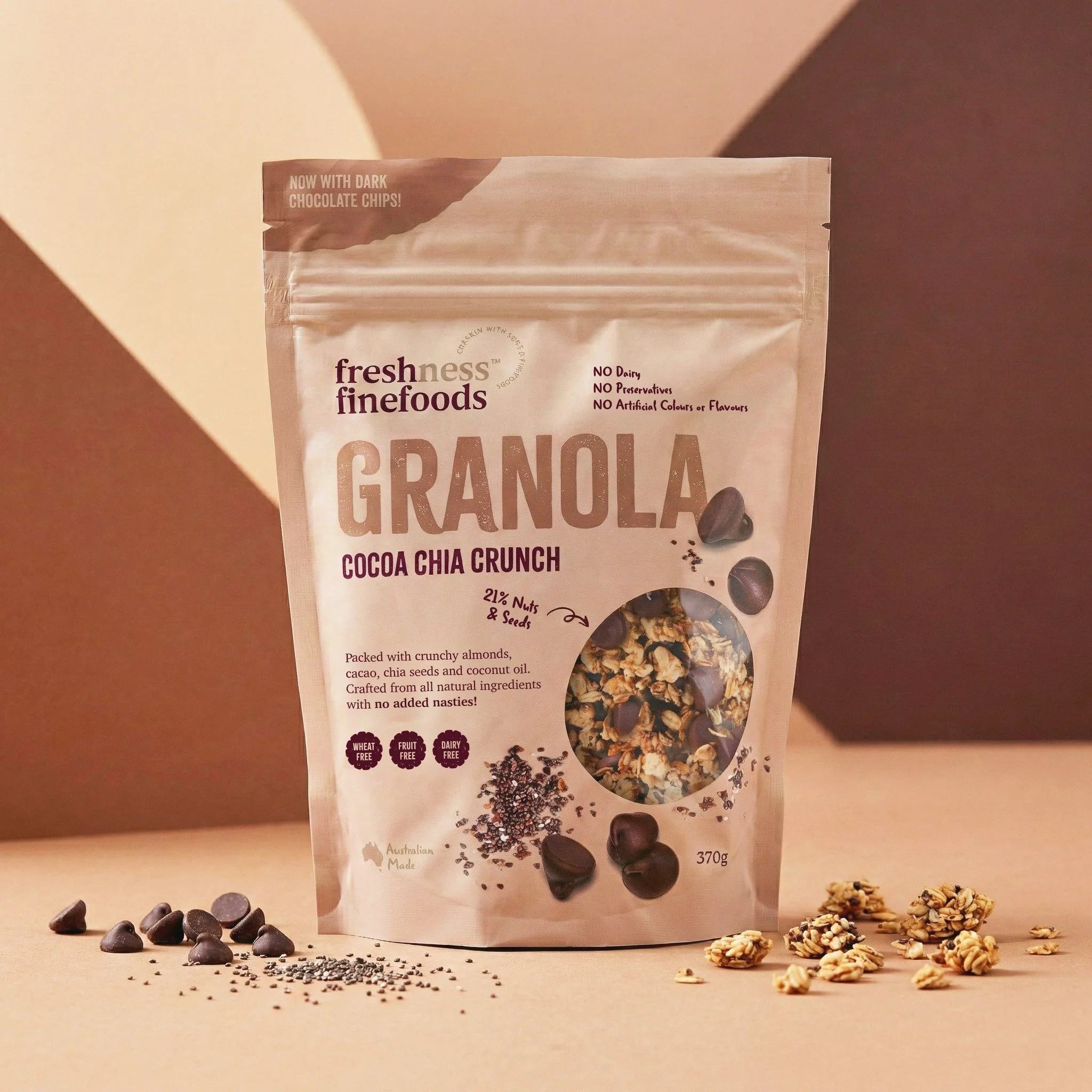
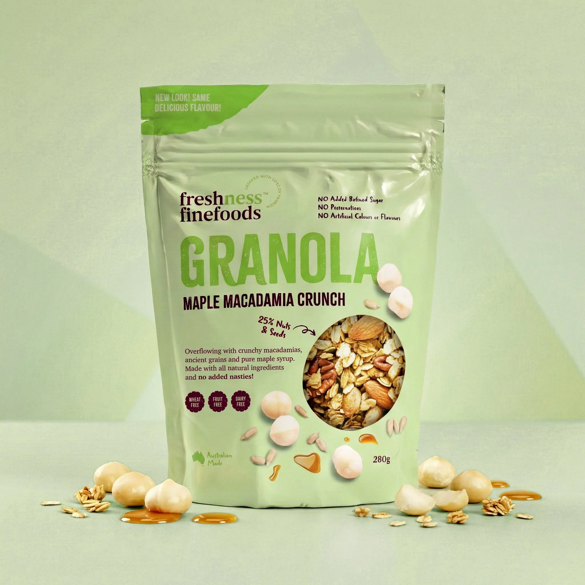
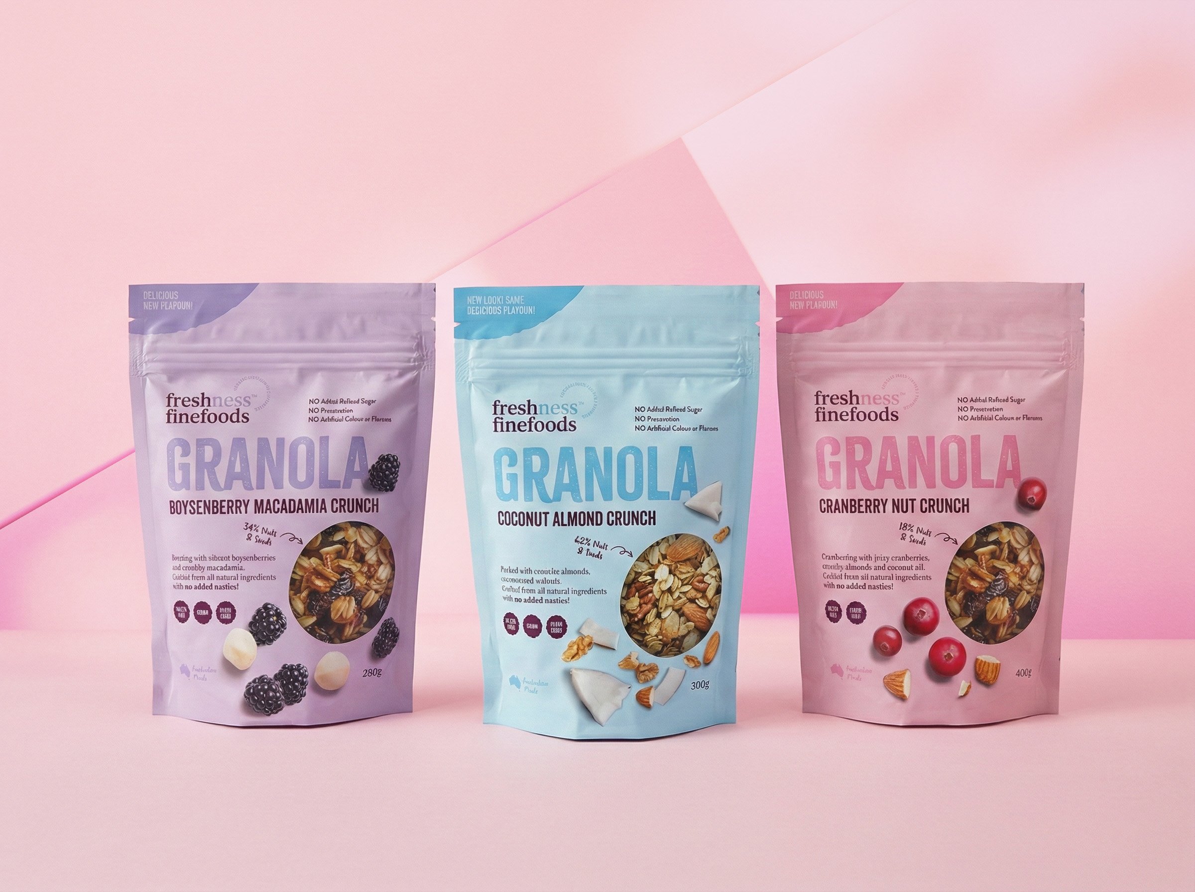
Fresh Ness engaged me to refresh their existing granola packaging, with the aim of creating a brighter, more appealing shelf presence and a brand that felt contemporary and premium rather than dark and budget-led. The existing designs lacked clarity and visual impact, particularly in a competitive health food and specialty grocery environment.
The focus of the project was to elevate the range while retaining its approachable, fun personality. The packaging system was re-worked using a palette of soft, pastel tones paired with cleaner typography and simplified layouts. The updated designs feel lighter, fresher and more confident, helping the product stand out without relying on heavy graphics or cluttered information.
By introducing stronger colour blocking and a more cohesive visual system across the range, the refreshed packaging improved brand recognition and created a clearer hierarchy on shelf. The result is a granola range that feels modern, optimistic and retail-ready, aligned with the expectations of health-conscious consumers and specialty food buyers alike.