

Designing for the Protein Bar Aisle
FRESH NESS FINE FOODS
- Packaging design
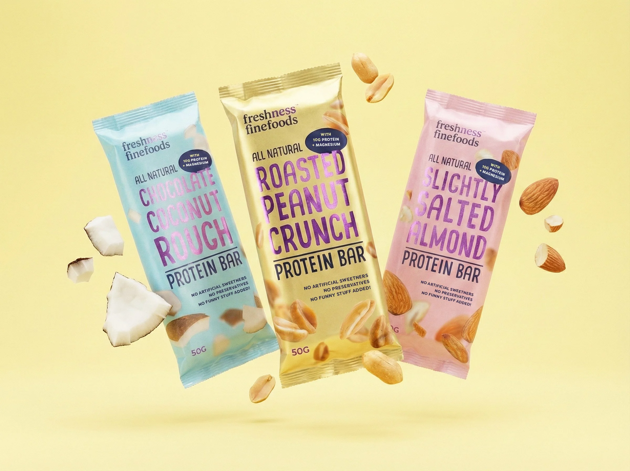
Fresh Ness developed a new range of protein bars designed for the functional, on-the-go snack market and required packaging that felt energetic, modern and visually competitive on shelf. The brief was to work within the existing Fresh Ness brand style at the time, while giving the product its own sense of presence and appeal.
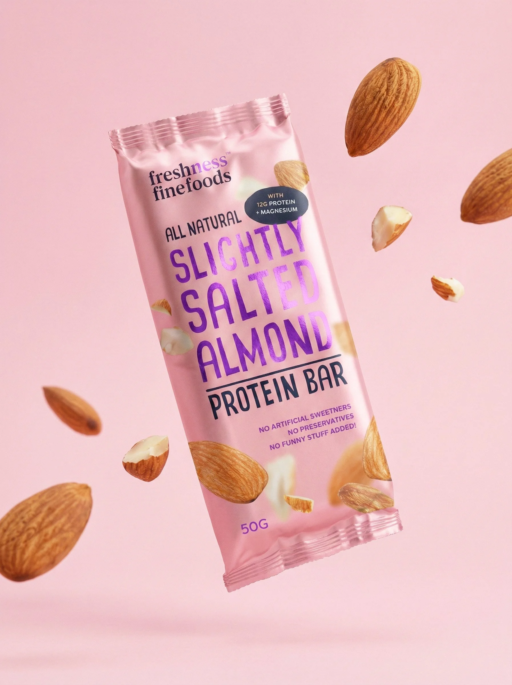
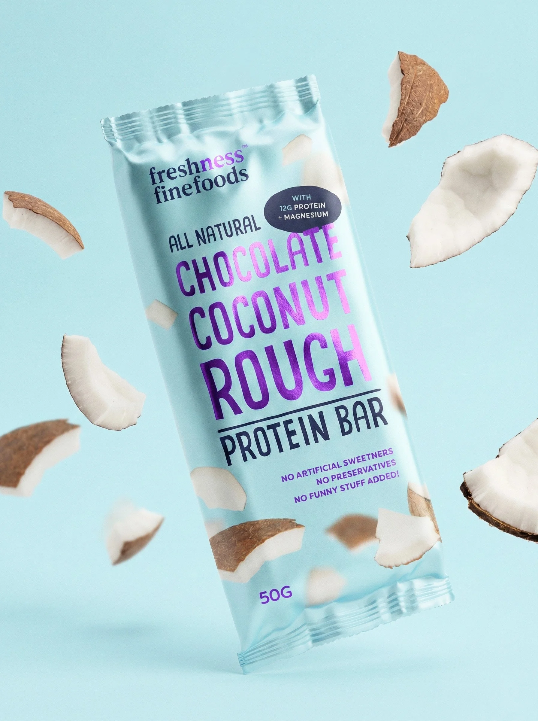
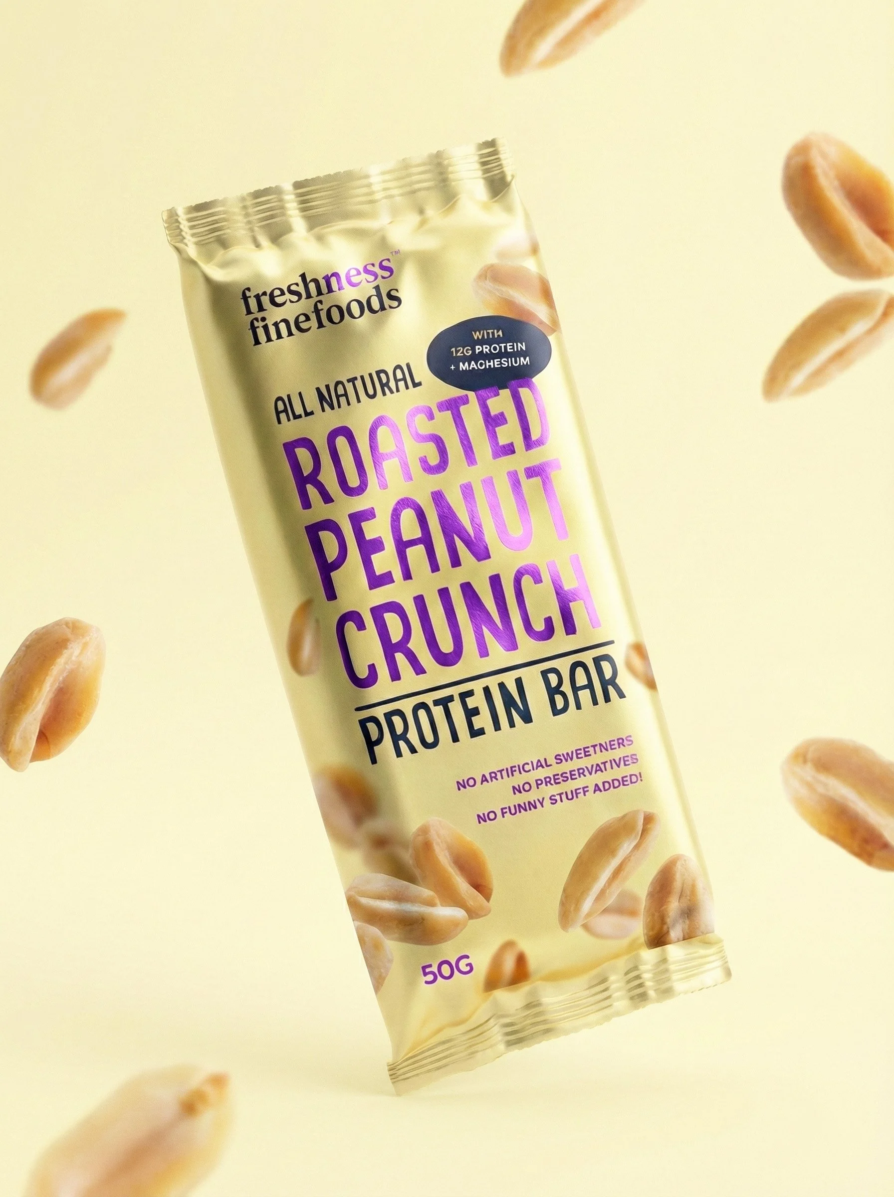
The packaging design was refreshed through the use of brighter pastel colourways, paired with a bold purple foil finish to introduce contrast, depth and a more premium feel. This combination helped elevate the wrappers beyond standard health food aesthetics, creating strong visual impact while maintaining brand recognition.
The resulting protein bar wrappers demonstrate how considered use of colour, material finishes and layout can significantly increase perceived value within a compact format. Designed to stand out in a crowded protein bar category, the packaging shows how an established brand identity can be extended into new product lines without losing coherence or personality.