

An Identity Built on Detail
LO & CO
- Visual Identity
- Catalogue
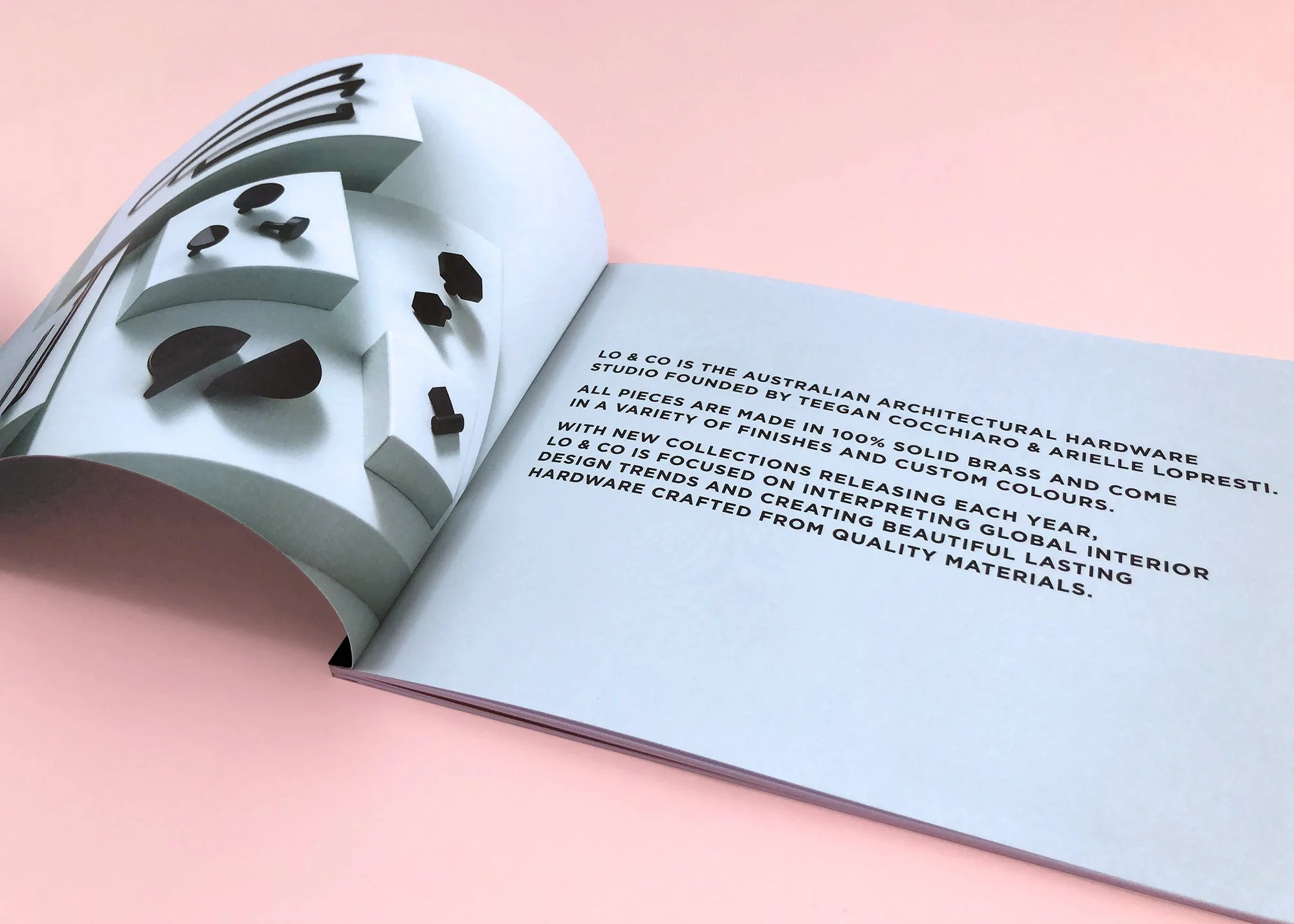
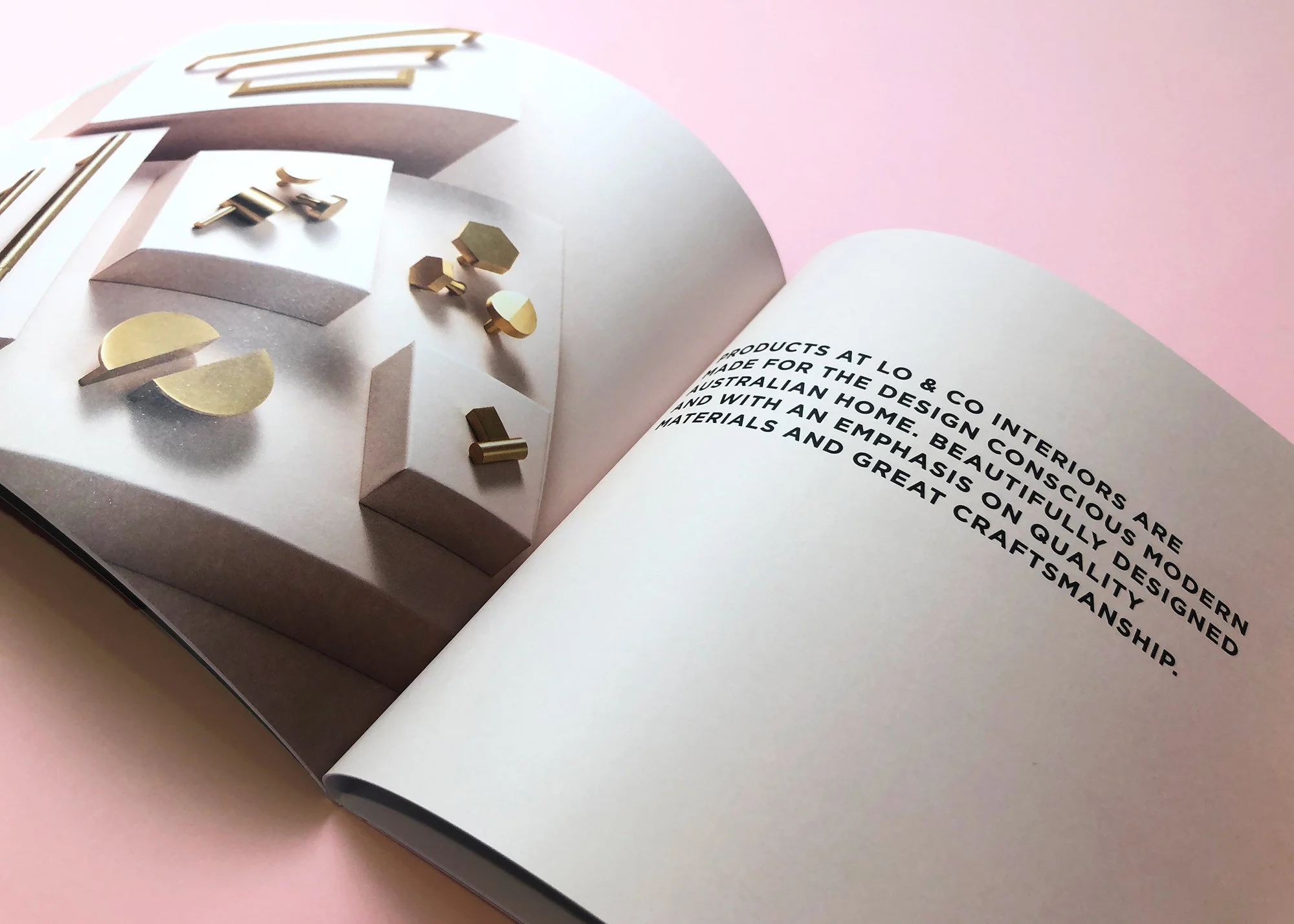
Lo & Co Interiors launched with a focus on premium cabinetry hardware, targeting interior designers, builders and renovators looking for considered, design-led finishes. As a new business entering a competitive interiors market, they needed a brand identity that felt refined, architectural and aligned with the quality of their product from the outset.
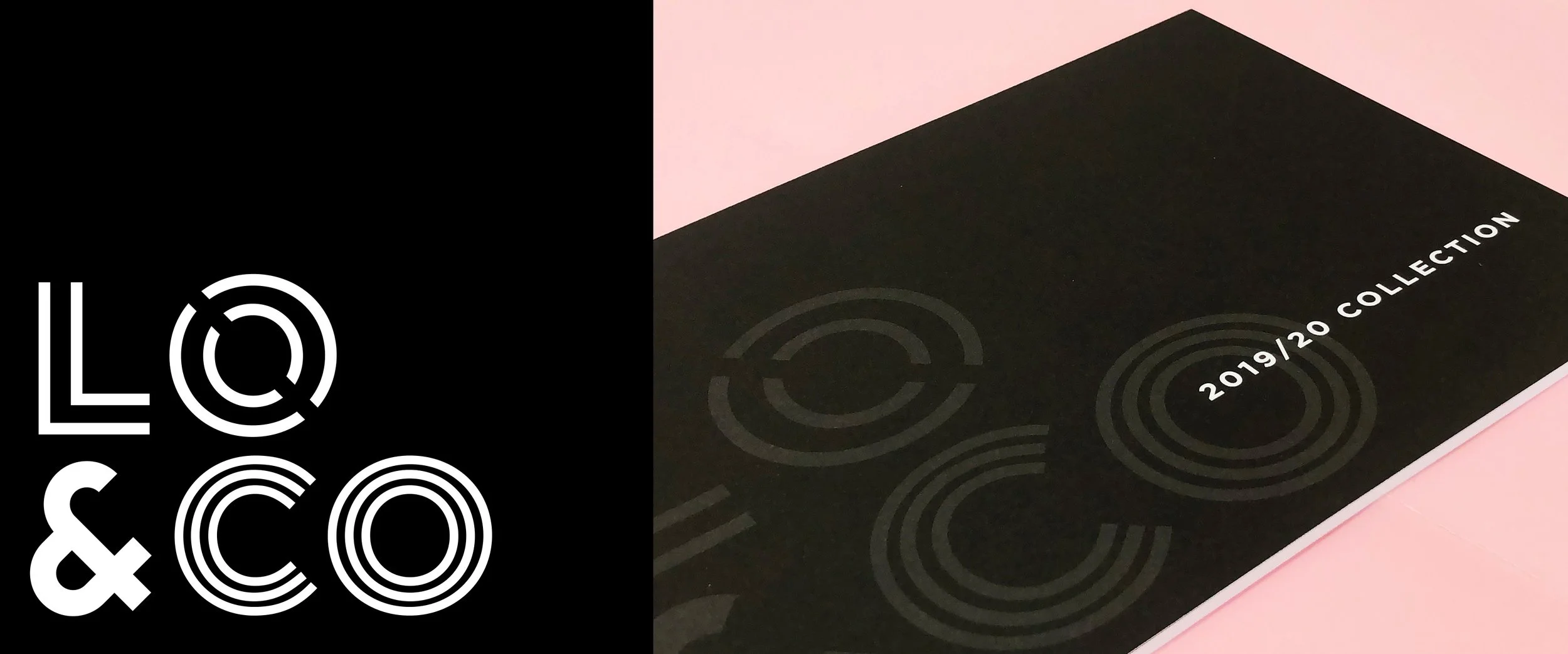
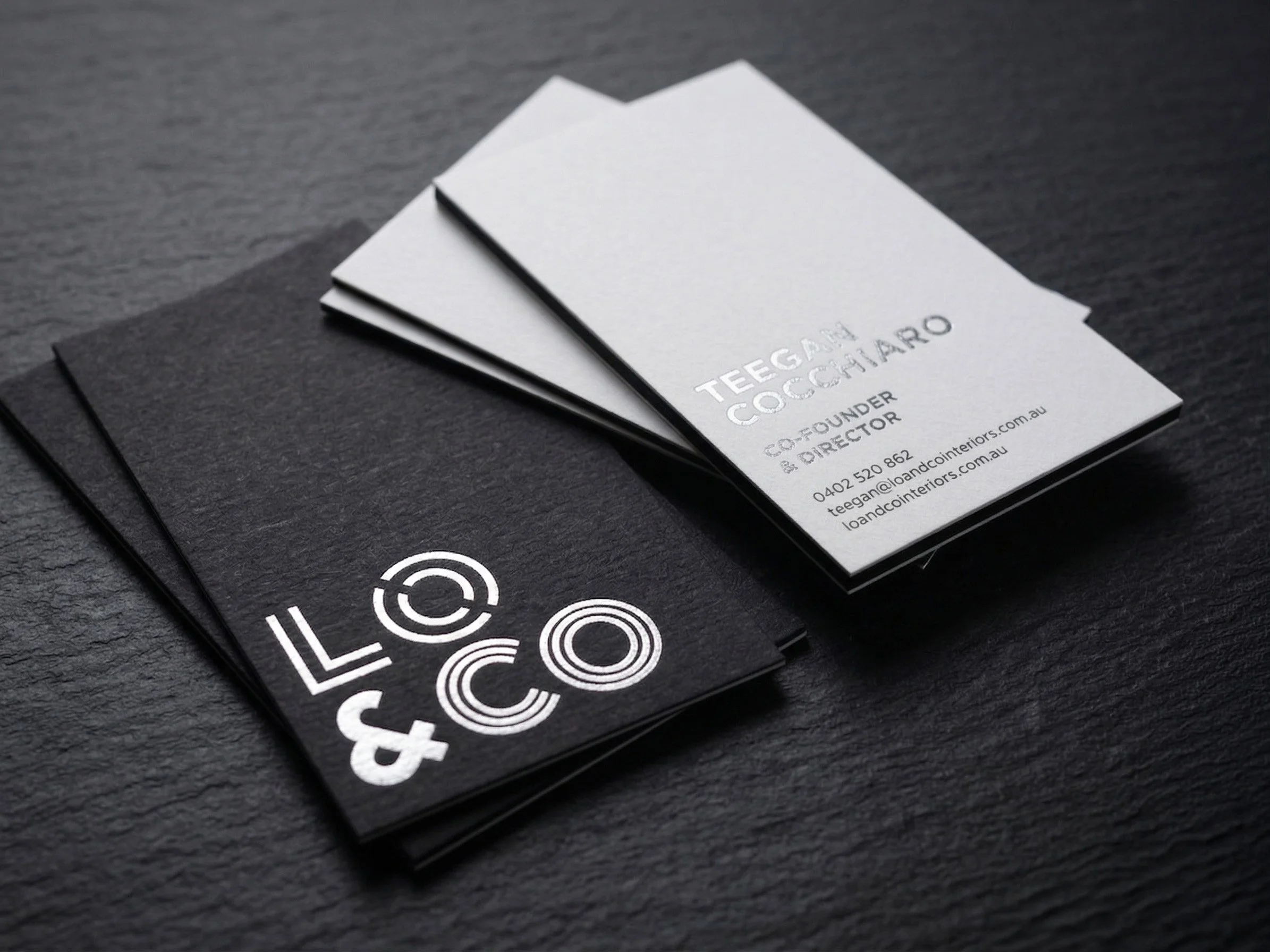
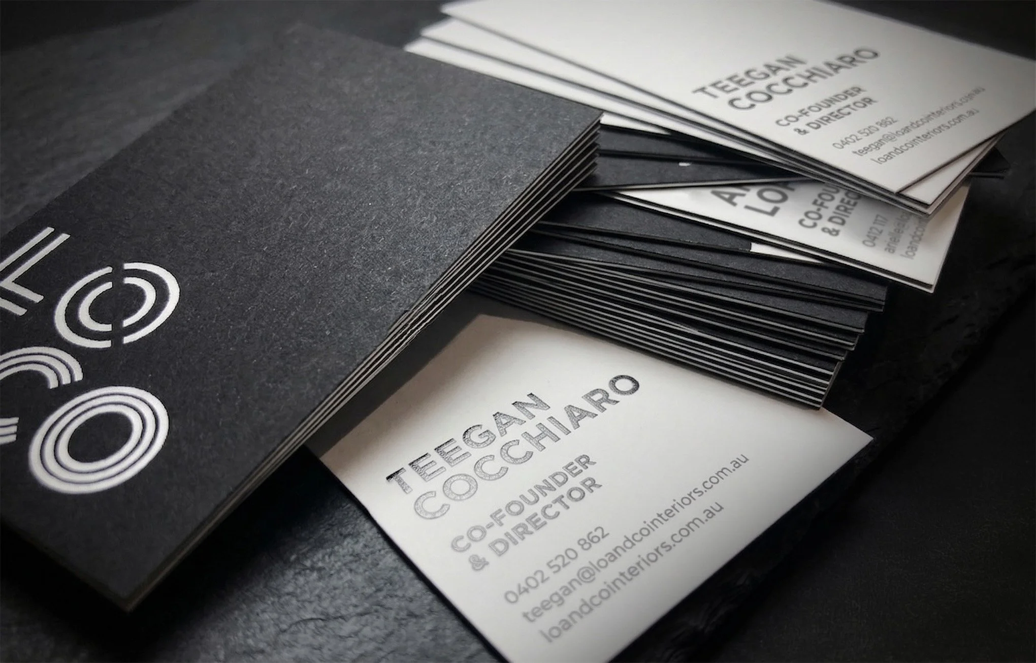
The visual identity was built around a custom typographic logo system, where each letterform is constructed using distinct shapes and line treatments. The concept reflects the layered nature of interior design not just colour, but texture, form and materiality. The varying weights, curves and structures within the logo subtly reference the finishes and details found in cabinetry hardware, creating a mark that feels both minimal and highly considered.
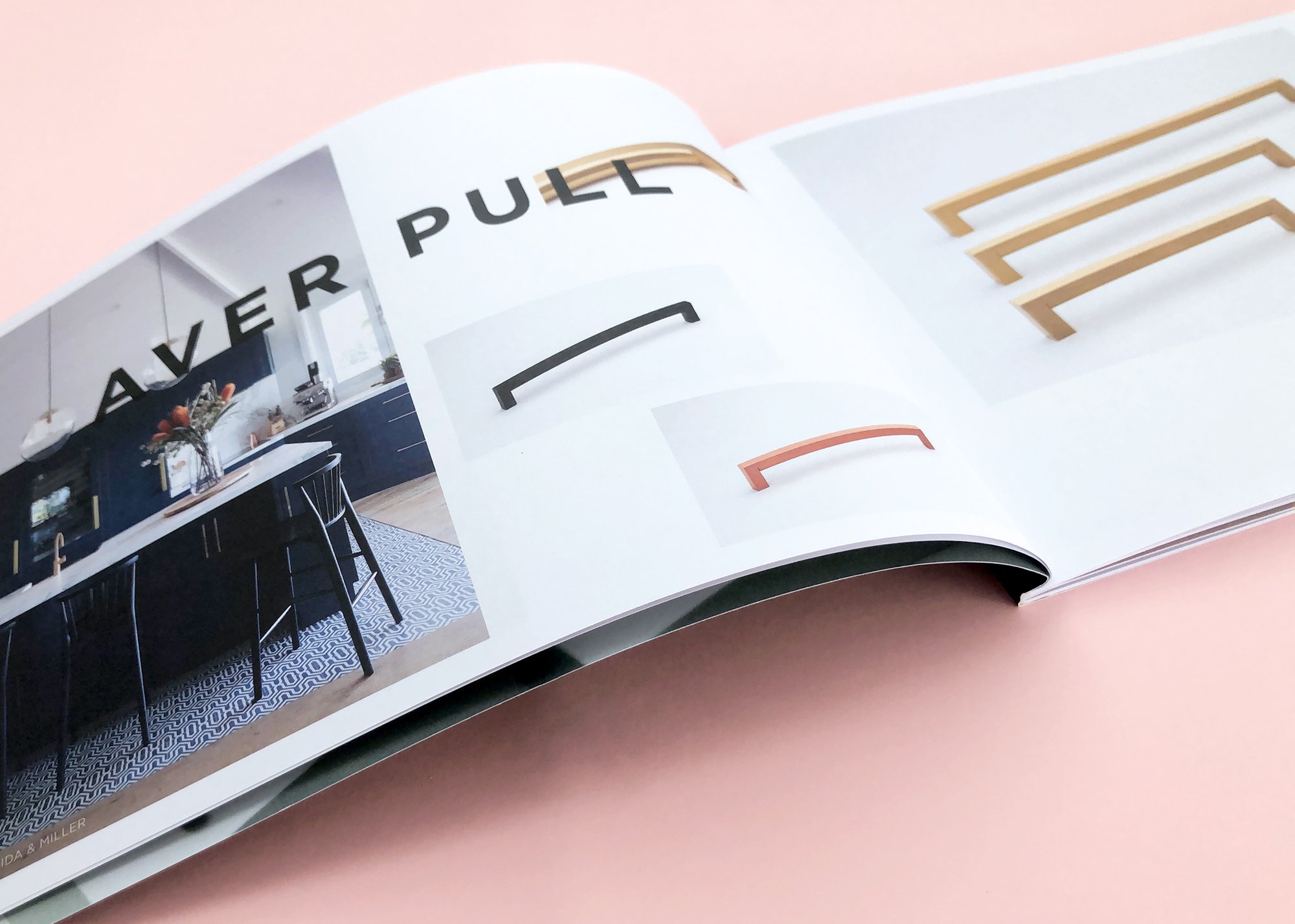
A restrained black and white palette was intentionally chosen to allow product photography to take centre stage across all brand applications. This approach ensures the brand remains timeless and flexible, while placing emphasis where it matters most — on the materials, finishes and craftsmanship of the hardware itself.
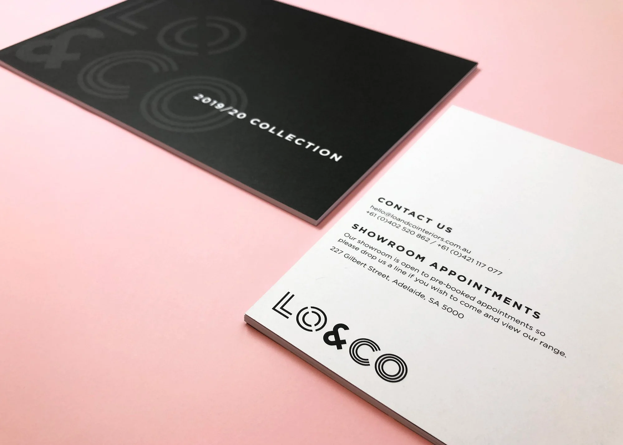
The identity was rolled out across key launch touchpoints, including a printed catalogue designed for trade shows and early client presentations. The result is a sophisticated, design-led brand that positions Lo & Co as a premium player in the Australian interiors and cabinetry hardware space, with a visual system built to scale as the product range expands.